Colour, Paint & Accents Home Decor Ideas
Walk into a room and colour is the first thing you notice, even before the furniture. It sets the mood before you sit down, it makes a small room feel open or a big room feel cosy, and it tells visitors something about the people who live there. Paint is the cheapest way to change that feeling, and soft furnishings, plants and art are the easiest ways to change it again without picking up a brush. This guide brings those ideas together in one place. It takes the best parts of four older guides, about dark paint, accent walls, indoor plants and tropical pillows and throws, and turns them into one practical plan you can actually use.
I have repainted rooms that looked tired in the morning and felt completely different by the evening, and I have also made the mistake of choosing a colour from a tiny swatch and wondering why it looked nothing like the picture once it was on the wall. The ideas below come from those real wins and real mistakes. You do not need a designer, a big budget or a whole weekend of work to use them. Start with one wall, one cushion or one plant, and let the room tell you what it needs next.
How to choose a colour palette that actually works
Before you buy paint, decide on the mood you want. Warm colours like red, orange and warm yellow bring energy and life to a room. Cool colours like blue, green and soft grey bring calm and quiet. Neither one is better. A busy family living room often feels better in warm, welcoming tones, while a bedroom or a reading corner often feels better in cool, restful tones. Think about what you do in the room first, then pick the colour to match that job.
Look at what you already own. Your sofa, rug, curtains and biggest pieces of furniture are already setting part of your palette, whether you planned it or not. If your sofa is neutral, you have room for a bolder wall or brighter cushions. If your rug is already bright and patterned, a softer wall will let it shine instead of fighting it. Take a photo of the room on your phone and look at it with fresh eyes. It is surprising how much easier the colours are to judge in a photo.
A little colour theory helps here, and it does not need to be complicated. Colours opposite each other on the colour wheel, like blue and orange or green and pink, create lively contrast. Colours next to each other, like blue and green or yellow and orange, feel calm and connected. You do not have to memorise the wheel. Just hold two swatches together and trust your eye. If they look happy together in your hand, they will usually look happy together in the room.
Light changes everything. A colour that looks soft and pale in the shop can look bright and cold in a sunny room, and a deep colour can look almost black in a room that gets little daylight. Always test paint samples on the wall, not just on a card. Paint a large patch, at least the size of a dinner plate, and look at it in the morning, at midday and in the evening. Live with it for two or three days if you can. That small wait saves a lot of repainting later.
The 60-30-10 rule is a simple way to keep a room balanced. About 60 percent of the room should be your main colour, usually the walls and the largest furniture. About 30 percent should be a second colour, often the curtains, rug or bedding. The last 10 percent is your accent colour, and that is where cushions, throws, art and plants come in. It is a guide, not a law, but it stops a room from feeling like every colour is shouting at once. For more room by room colour and layout ideas, see our living room decor ideas.
Dark, moody paint colours that make a room feel expensive
Light, airy rooms are lovely, but dark, moody colours bring a different kind of comfort. Deep navy, forest green, charcoal grey and warm burgundy can make an ordinary room feel like a quiet, grown up retreat. They add depth and drama, and they make light furniture, brass lamps and
pale art stand out beautifully. The trick is to use them on purpose, not all at once.
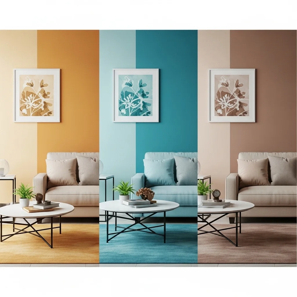
An accent wall is the easiest place to start. Paint one wall in a deep, bold colour and leave the rest light. A rich navy or forest green wall behind a bed or a sofa anchors the whole room and makes it feel more intimate. It also gives artwork and shelves a strong backdrop. This works especially well in bedrooms and living rooms, where you want one clear focal point instead of four competing walls.
If you love the look, you can go further and paint a whole room in a darker shade. A deep charcoal or dramatic navy living room can feel like a cocoon in the evening, especially with warm lamps and soft textiles. Keep the ceiling pale if the room is small, or paint the ceiling dark too if you want a truly cosy, enclosed feeling. A dark ceiling sounds strange until you try it in a bedroom. It draws the eye up, hides awkward corners and makes the room feel like a proper place to sleep.
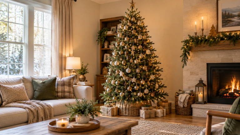
Dark colour does not have to come from paint alone. A deep mahogany dining table, a black velvet sofa or dark wood shelves add the same richness, and they are easier to move if you change your mind. Balance those pieces with lighter cushions, a pale rug or cream curtains so the room does not feel heavy. Warm, soft lighting matters more than ever with dark colours. Swap harsh white bulbs for warm ones, add a floor lamp or a small table lamp, and let the corners glow instead of glaring.
Natural materials keep dark rooms from feeling cold. Wood beams, stone, linen, wool and rattan soften the edges of a dark wall. Plants do the same job in a different way, and we will come back to them in a moment. A dark bathroom is a good test case too. Dark tiles, deep coloured towels and simple brass or black fixtures can turn a plain bathroom into a calm, spa like space at the end of the day. For calm bedroom and bathroom colour ideas, see our bedroom and bathroom decor ideas.
Accent walls, art and pattern, done without the mess
Choosing an accent wall colour is only half the job. How you finish that wall matters just as much. A matte finish feels soft and warm, and it hides small bumps in the plaster. A gloss or satin finish reflects light and makes the colour look brighter and sharper. Faux finishes like sponging or stencilling can add interest, but keep them simple. One clear texture is usually enough, and two competing textures can make a wall look busy.
Adjustable lighting helps you get the colour right. A dimmer switch, or even just a lamp you can move around, lets you see how the wall looks in bright light and in soft evening light. Some colours change a lot between day and night, and that is not a flaw. It is part of their charm, as long as you have seen it before you commit.
Art and pattern are where an accent wall earns its keep. Bold artwork with deep tones or strong contrast looks at home on a dark wall, and a gallery wall of smaller frames can turn a plain stretch of paint into the best part of the room. If you like pattern, mix it with care. A floral cushion with a striped throw, or a geometric rug with a plain sofa, can work beautifully if the colours link them together. Pick one pattern to lead and let the others support it. That way the room feels playful, not noisy.
Take inspiration from nature when you get stuck. Earthy greens, sky blues, warm sunset oranges and soft stone greys all come from landscapes we already love. They rarely clash, because we have seen them together outdoors for years. If you want a natural, farmhouse feeling with those colours, our rustic, farmhouse and western home decor ideas show how wood, linen and muted colour work together.
Pillows, throws and textiles: the fastest colour change in the house
If paint is a commitment, pillows and throws are a low risk experiment. You can change the whole colour story of a sofa in ten minutes, and change it back just as fast. That makes textiles the best place to try a bold colour you are not quite sure about yet.
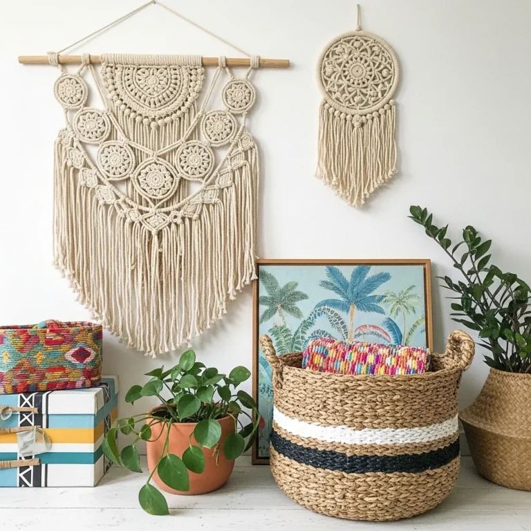
Tropical prints are a good example. Pillows with hibiscus flowers, palm leaves or beach scenes bring instant colour and a relaxed, holiday feeling to a plain sofa. Mix those bold prints with solid cushions in green, blue, coral or yellow, and the room feels fresh without feeling like a theme park. Natural fibres help here too. Throws in jute, linen or cotton add warmth and texture, and they echo the materials you would find in a warm, coastal place.

Layering is the skill that makes it look intentional. Mix large square cushions with smaller rectangular ones, and vary the shapes and textures instead of lining up four identical pillows. Drape a lightweight throw over one arm of the sofa or across the end of the bed, and let it look a little relaxed. Seasonal throws are useful for the same reason. A light floral or beach throw in summer can be swapped for a heavier knit in winter, and the room changes with the season.
Small details make a big difference. Tassels, fringes and embroidery add playfulness to a plain cushion, and one or two statement pieces, a pillow with an artistic tropical scene or a throw with an unusual pattern, can anchor the whole sofa. Balance all that colour with neutrals. Soft white, cream or beige furniture and walls let bright pillows stand out, and they keep the room feeling airy. If you want to carry the look outside, use weather resistant pillows and throws on a patio or balcony. For outdoor colour and seating ideas, see our home exterior and outdoor decor ideas.
Finally, make it yours. A cushion with a quote you love, a throw in a colour that reminds you of a favourite trip, or a pattern you chose just because it makes you smile will always look better than a perfect set you bought because a shop told you to. Colour should feel personal, not copied.
Plants are colour too: green accents that soften paint
Green is the one colour that works with almost every paint colour, and plants bring it into a room in the most natural way possible. They soften dark walls, warm up pale walls and add life to a corner that would otherwise sit empty. They also help a room feel calmer, and caring for them gives you a small, pleasant routine.
Start by choosing plants that suit your light and your habits. Pothos, snake plants and ZZ plants are forgiving and good for beginners. They cope with low light and the occasional forgotten watering. If you enjoy a bit more care, try orchids or a fiddle leaf fig in a bright spot. Match the plant to the room, not the other way round, and you will spend far less time worrying about it.

Where you put plants matters as much as which ones you choose. A vertical garden on a bare wall, made with wall mounted planters or a simple trellis, turns an empty space into a living feature. Plant stands and floating shelves lift plants to different heights, which adds depth and helps them get light. A dedicated plant corner, with a mix of tall and trailing plants, a comfortable chair and soft light, becomes a small retreat inside your own home.
Window sills are natural display areas, especially for herbs, small succulents and flowering plants. Keep them uncrowded so each pot can be seen. Terrariums are a good option for small spaces or desks. A clear glass container with soil, stones and a few small plants makes a tiny, low maintenance garden you can enjoy up close. Creative containers add personality too. A vintage teacup, a mason jar or an old wooden crate can be a planter, as long as it drains well and suits the plant inside.
Group plants in odd numbers and at different heights for a natural, jungle like feel. Trays and large planters help a group look connected instead of scattered. Edible plants earn their place as well. Herbs, cherry tomatoes and dwarf fruit trees bring fresh ingredients to your kitchen and a lovely scent to the room. Whatever you grow, build care into your routine. A simple weekly check for water, a quick prune now and then, and repotting when a plant outgrows its pot will keep your green accents looking good for years. For budget friendly ways to display plants, art and colour together, see our DIY and general home decor ideas.
Put it together, room by room
In the living room, start with the wall you see first when you walk in. That is usually the best accent wall, and it is where your largest art or your television will sit. Add a rug that picks up one colour from the wall, then cushions and a throw in your accent colour. A tall plant in the corner will soften the whole arrangement, and a lamp with a warm bulb will make the dark colours glow in the evening.
In the bedroom, keep the palette quieter. A deep colour behind the bed, soft bedding in a lighter tone and one or two cushions in a warm accent colour is often enough. Plants that like low light, like a snake plant, work well here, and they do not need much attention. Keep patterns simple so the room feels restful rather than busy.
In the bathroom, dark colour works best in small doses if the room is tiny. Dark towels, a dark bath mat or a painted cabinet can give you the spa feeling without making the room feel smaller. Add a small plant that likes humidity, and use warm light instead of cold white light.
In a small space, colour can help rather than hurt. One strong accent wall can make a small room feel deeper, and a mirror opposite a window will bounce light around it. Keep the rest of the palette light, use plants at different heights instead of on the floor, and let one bold cushion do the talking instead of five. For clean, calm colour schemes that suit small rooms, see our modern and minimalist home decor ideas.
Mistakes that make colour look wrong, and easy fixes
The most common mistake is choosing paint from a small card in a shop and painting a whole room with it. The fix is simple, and it is the same advice you have already read: paint a big sample, look at it at different times of day and live with it for a few days. The second mistake is using too many strong colours at once. If a room feels loud, take one colour out, not one more in. Put a cushion away, swap a bright throw for a plain one, and see if the room calms down.
Another common mistake is forgetting the lighting. A room with one harsh ceiling light will make even the best paint look flat. Add a lamp, use warm bulbs and let light come from more than one place. The last mistake is copying a photo exactly. A colour that looks perfect in someone else’s bright, south facing room may look very different in yours. Use photos for ideas, then test the colours in your own light, with your own furniture, before you commit.
A simple weekend plan to start
If you want to start this weekend, keep it small and finish it. On Saturday morning, pick one room and one wall, and paint a large sample patch in the colour you are considering. While it dries, look at your cushions, throws and plants and decide which accent colour you want to keep. On Saturday afternoon, move one plant to a better spot, add a throw to the sofa and hang one piece of art on the wall you are testing. On Sunday, look at the room in daylight and in the evening, and decide whether the sample colour feels right. If it does, paint the wall next weekend. If it does not, try a lighter or warmer version of the same colour. You have not wasted a weekend. You have learned what your room actually wants.
Colour, paint and accents work best when they work together. Paint sets the mood, textiles let you change it, art and pattern give it personality, and plants soften it and bring it to life. You do not need to do everything at once. Pick the idea that feels easiest, try it in one room, and let the result guide your next step. A home that grows one colour at a time usually ends up feeling more personal, and more like you, than a home that was finished in a single shopping trip.