Christmas Color Schemes for 2026: Jewel Tones, Heritage Plaid, Pink and Neutral
Two years ago I set up my Christmas tree with ornaments from three clearance sales. The result was a mix of rose gold, silver, red and lime green that simply clashed on the branches. The pictures were awful. The tree actually looked tired when I saw it. The solution was not to buy ornaments. It was to choose a Christmas color scheme and put all the other pieces back in the box.
This guide is about that simple choice. Below I list the four Christmas color schemes that will be popular, in 2026: jewel tones, heritage plaid, pink and neutral Scandinavian. For each scheme I give the colors, what to buy first how much it costs and the single mistake that can ruin the look. Choose the scheme that matches the home you already have not the scheme shown in someone ‘s photo.
How to choose before you spend anything
Begin by looking at your light. Rooms that face north or have light become boring quickly in December. I have seen that north-facing rooms lose their sparkle in December. Dark rich colors become deeper when the light is dim. Light pale colors may look grey and sad by four in the afternoon. Rooms that are bright and full of sunshine can hold pink and ivory without the colors fading. Stand in the room at the time you normally use it in the evening and decide based on that not on the bright lights of the store.
Next examine your furniture because it stays where it is. A warm brown leather sofa, dark wood bookcases or a grey fabric sectional already tells a story about color. Plaid patterns and jewel tones fit well beside leather and dark wood. A light grey or beige sofa is like a sheet and pink and neutral color schemes were made for it. I used to think a bold décor needed colors but I learned the opposite. If your everyday décor is already bold our guide to home décor (https://globwriters.com/top-10-colorful-home-decor/) uses the same rule all year: one color palette, repeated is better than five different ones.
Finally be honest about the money you have. A color scheme you can only pay for halfway looks worse than a color scheme that you finish fully. Every color scheme below can begin for, than fifty dollars if you buy in the right order: ribbon ornaments and one textile first. Those three items are what your eye sees as the theme. The tree topper and matching stockings can wait until year. I once thought the tree topper mattered more. I realized the ribbon is what draws the eye. No one has ever visited a house. Said, “Lovely but the stockings do not match the ribbon.”
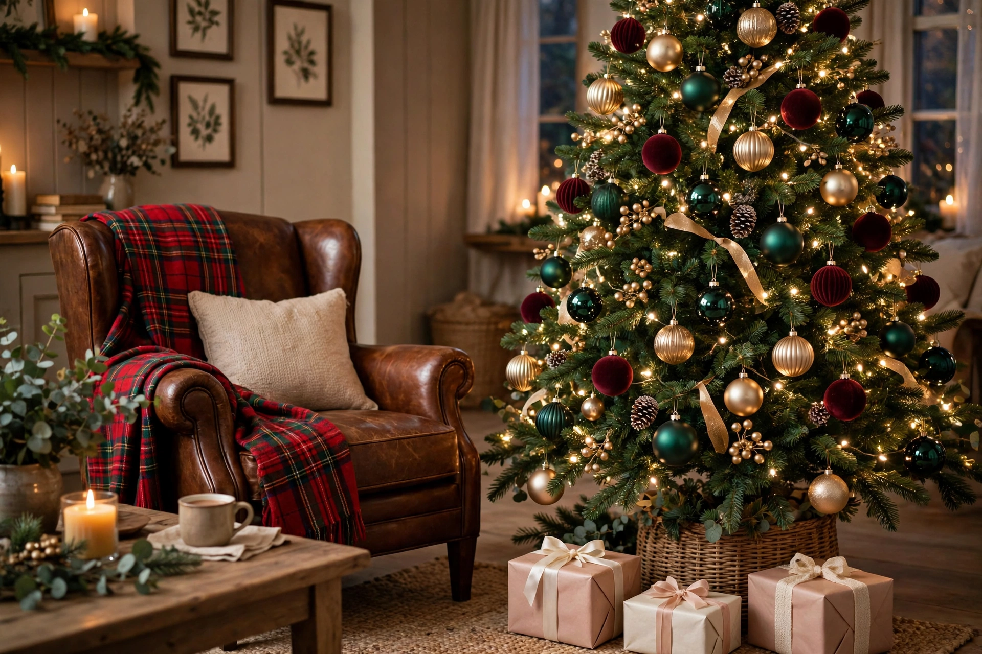
1. Jewel tones: emerald, burgundy, plum and champagne gold
The palette: emerald green and burgundy as the two leads plum as the supporting color and champagne gold as the only metal. If you add a color make it a deep navy and stop there.
Where it works best: Living rooms and dining rooms with warm furniture, wood floors and low evening light. This is the scheme for homes that already feel a bit traditional or moody. The dining room is where it honestly shines, burgundy and candlelight over a table is hard to beat.
Buy first:
- ribbon in emerald or burgundy for the tree and wreath $8-12 a roll and it does more than any ornament set
- A mixed box of burgundy and emerald baubles, matte and shiny finishes $15-20
- Two cushion covers in plum or burgundy velvet $16-22 for a pair
- Champagne-gold candlesticks or a small set of gold votives $12-18
- A deep green or burgundy throw, for the sofa $20-28
Metals and finishes: Champagne gold and antique brass. Skip chrome and bright silver here cool metals fight the warmth. Make the whole scheme look cheaper than it is.
The mistake everyone makes: Using all three jewel colors at strength everywhere until the room turns into a cave. Pick two leads and one accent keep your walls, rug and big furniture neutral and let the jewel colors live in the tree, textiles and table. See how the palette sits on the tree itself in our Christmas tree ideas for 2026 (https://globwriters.com/christmas-tree-ideas-2026-stylish-cozy-decorating-ideas/).

2. Heritage plaid: the “Ralph Lauren” Christmas
The exact palette for Heritage plaid is Holly red and hunter green as the base. A red-green-navy tartan plaid forms the pattern. Camel and cream tones soften the look while dark wood lies underneath everything.
Where Heritage plaid works best: Houses with fireplaces, wood furniture, leather, bookshelves, anything with a bit of age or weight. Heritage plaid is the forgiving scheme for older homes because Heritage plaid was basically designed for them. In a white minimalist apartment Heritage plaid can look like a costume so be honest about your space.
Buy first:
- One plaid throw or two plaid cushion covers choose ONE not both $18-35
- Stockings in red or hunter green $15-20 for a set
- Aged-brass bells or candlesticks $12-16
- Wide velvet ribbon in dark red for the tree $9-12
- A tartan table runner if you host, $15-22
Metals and finishes for Heritage plaid: Aged brass and oil-rubbed bronze, plus dark wood wherever you can show it. Polished gold looks too new; Heritage plaid wants metals that look like they have been in the family a while.
The mistake everyone makes: Plaid on the throw the cushions, the stockings, the wrapping paper and the dog. Plaid is a pattern; one large piece must be the statement and everything else must be solid colors pulled from Heritage plaid. The other classic error is pairing this scheme with blue-white LED lights. Use white (2700K) or the whole room goes cold and Heritage plaid looks muddy. If you build your tree around this look the styling in our 10 Christmas tree decor ideas (https://globwriters.com/top10-christmas-tree-decor-ideas/) pairs well, with Heritage plaid.

3. Pink Christmas: blush, dusty rose and one deep anchor
The exact palette: Two routes, pick one. Soft and chic route features blush dusty rose, ivory and champagne gold. Bold route mixes blush with true cranberry red, which sounds odd but looks fantastic. Pink Christmas searches grew ninety five percent this year.
Where the palette works best: rooms, light-colored furniture, modern and glam-leaning homes and smaller spaces where red-and-green feels heavy. The palette is a good apartment scheme because light colors do not shrink a room the way dark jewel tones can.
Buy first:
- A set of blush and ivory ornaments $14-18
- velvet ribbon, $8-10
- One dusty rose cushion cover or throw $15-24
- Pink or ivory tapered candles, $9-12
- A gold star or bow tree topper $10-14
Metals and finishes: Warm gold is the palettes friend. Rose gold works too. Pick one metal and stick to it because gold and rose gold side by side just look like a mistake. Avoid silver unless the pinks are icy blue-pinks.
The mistake everyone makes: Going all pastel with no anchor. Blush on blush on ivory with nothing deep reads “baby shower,” not Christmas. The fix is one color in small doses, cranberry red ornaments, a burgundy ribbon or deep green foliage, underneath the pink. That contrast is what makes pink look deliberate and chic of sweet.
4. Neutral and Scandinavian: ivory, pale wood, glass and paper
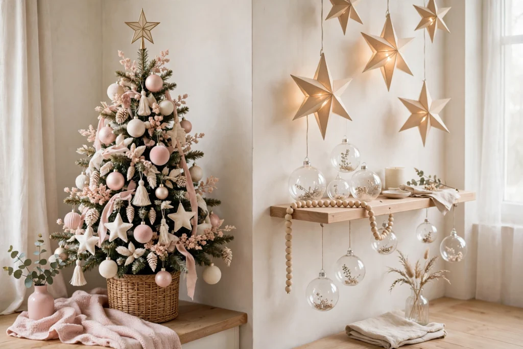
The exact palette: Ivory and warm white as the base, pale birch wood, clear glass and soft touches of grey or muted sage. Color comes from greenery, not ornaments.
Where it works best: rooms, minimalist and Scandi-style homes and bright spaces. This is also the scheme if your house is already busy with kids, pets and everyday stuff it adds Christmas without adding visual noise. Renters like it because almost nothing here needs nails or commitment.
Buy first:
- Paper star lanterns or folded paper ornaments, $10-16
- A wooden bead garland, $10-14
- Ivory or cream knit stockings, $16-20
- glass baubles, some filled with a sprig of greenery $12-15
- A cream or sheepskin-style throw, $18-25
Metals and finishes: Barely any, on purpose. Pale wood, matte black in doses (a candle holder, a star) and clear glass do the work. If you must have a metal, brushed silver in amounts keeps the cool quiet feel.
The mistake everyone makes: Flat beige everything. Neutral fails when every item is the color AND the same texture it stops reading as calm and starts reading as unfinished. This scheme lives on contrast: rough wood against smooth glass, soft wool against crisp paper real greenery, against ivory linen.. Use warm-white lights always. Cool white LEDs turn this look clinical.
The one rule that ties it together
The one rule that ties it together is this: no matter which style you choose use the color palette across the tree the mantel and the table. That’s what makes a home feel like it belongs together of just having rooms that look different. If you want to use a scheme in another room, like pink in the bedroom and plaid in the living room, still share one piece between them. Use the ribbon or the same kind of metal and the whole house will still feel like one place.
Still not sure between two options? Try this: lay out your three decorations from each color scheme on the sofa tonight. Put them under your lamps so you can see them clearly. Just watch them for ten minutes. The one that doesn’t fit? It usually becomes obvious. The wrong choice usually drops out on its own.
Then do this first: buy the ribbon. It’s the thing, on the list.. It touches the tree, the wreath, the gifts and the mantel. Once you’ve picked the ribbon everything else gets easier. The whole theme isn’t real until the ribbon is chosen. After that you’re just adding details.